Hi Folks,
It's Robb Beal.
This is a summary of some of my product work at Booksource where I led a team that rehabbed/reinvented the user experience of an extensive educator- and student-facing web app, in a market/domain I was new to, with a small team that had never worked together before, half of which were new to the company, in about 75 working days (really!), with super-high quality.
The work achieved 30% YOY MAU growth after slow-to-no growth over the previous couple of years.
I played the role of Product Manager and Product Designer supported by a Junior Product Manager, 2 Engineers, and a contract Visual Designer.
The best part of this project was getting an ovation from my management peers soon after its launch.
The most challenging aspect of this project was that there was so much accumulated design and technical debt that made making improvements difficult. Further complicating things was that the web app shares logic and data with 2 other major apps (a native mobile app and a school-level library organizer app) which practically could not be improved at the same time. For a taste of just how far we took this app, follow the links to shots of the previous version.
Classroom Organizer Fall '16 Rehab
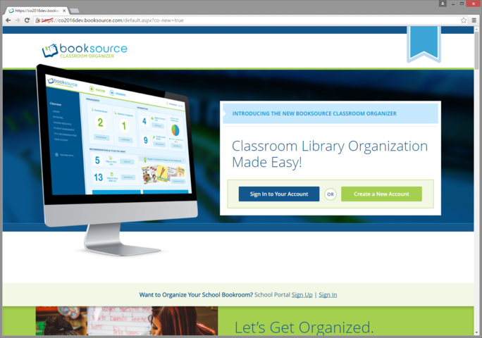
Users see this until they've successfully logged in once. I find this approach much more preferable than giving the site landing page 2 different purposes: Marketing and Login/Account Creation. Most of the time taking that approach means doing both of those poorly.
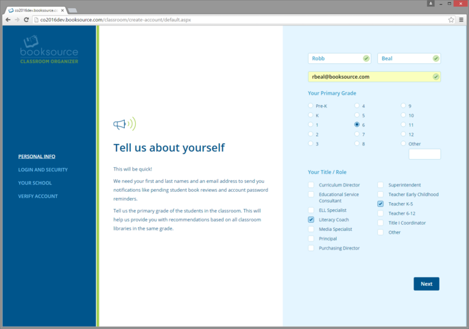
We were inspired by the design form that Simple.com used for its Sign Up. The middle section makes it clear to users "Why" we ask for certain info.
TEACHER-FACING EXPERIENCE
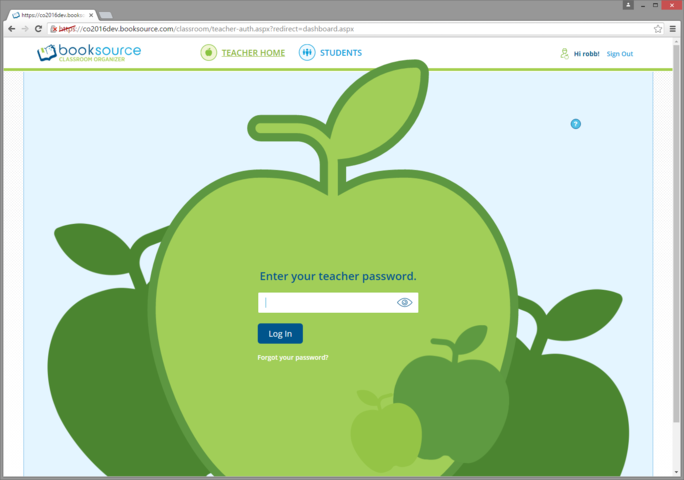
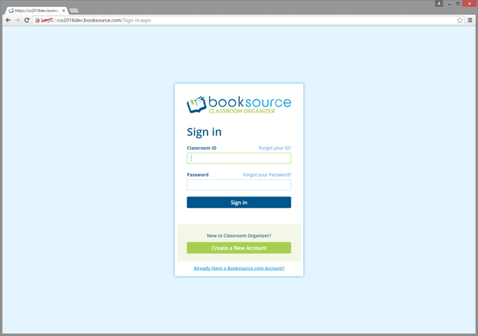
Unable to eliminate this 2nd password for teachers, I asked the visual designer to invest time in making this a beautiful moment for Teachers as a way to help them forget how inconvenient this additional prompt is.
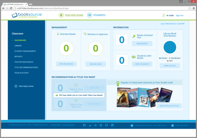
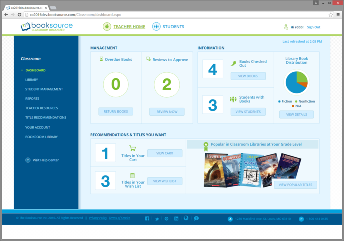
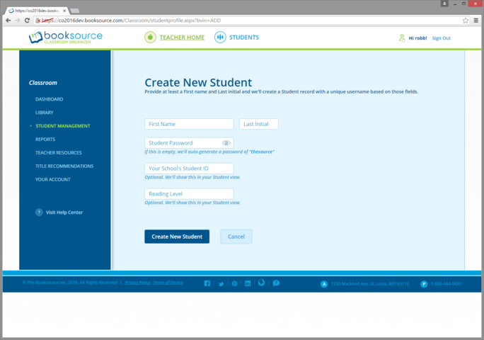
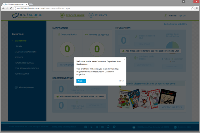
This is the app's Home Page. (See also: the shot below.) Previous versions of the app effectively had no Dashboard like this. (Additionally, the app previously had no ubiquitous left nav.) If you wanted the info shown here, you had to go dig through the app to find it. We developed a large amount of candidate content/functionality for this page and used attitudinal and qualitative user research methods to arrive at the point you see here. In order to align the design and business strategy, we included e-commerce content/functionality that too was previously buried within the app.
Note: This is a shot from late development that was further improved before shipping.
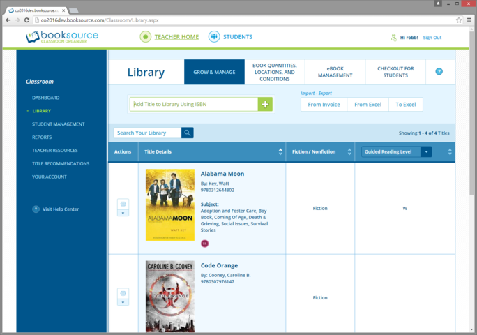
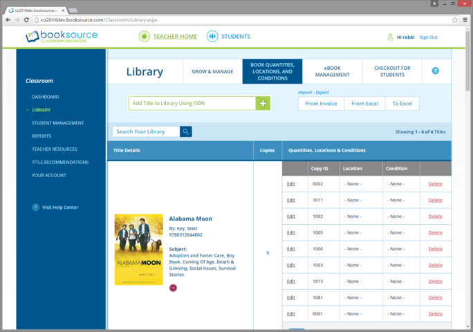
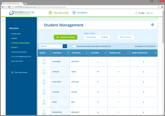
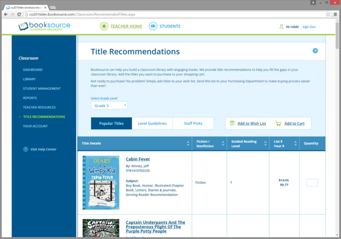
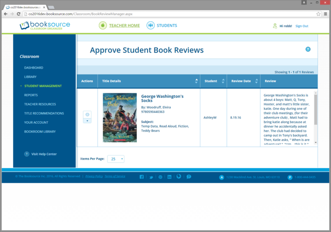
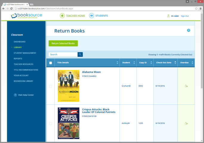
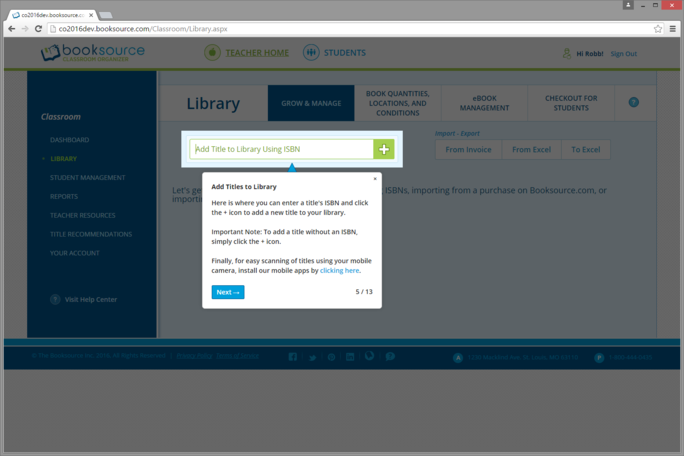
This Library page, a key site page where teachers add and manage books, was the most challenging portion of the redesign. The previous version of this experience (see link) was a single page that attempted to satisfy a ton of use cases all in a single page. It did that horribly and because of its complexity, wouldn't allow for new functionality or promotion.
I broke the page up into 4 subpages each mapping to important use cases. Especially important was the creation of a separate page for eBooks. The thinking here was that given appropriate real-estate, we could do thoughtful eBook promotion to users (e.g., click now to automatically place a free eBook in your Library).
An additional major improvement here was the teacher library search functionality, moving from a search input affordance for every piece of book metadata to a simpler, single search input affordance + reserved prefixes (e.g. interest-level:K-3).)
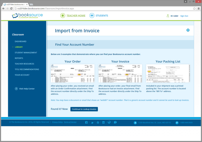
Previous versions of this page did a really poor job of letting customers know how to find the Booksource account number that was necessary to import books.
I worked across the organization to unearth all of the various physical and digital artificats that Booksource customers would receive that displayed their account number. This page visually describes the 3 artifacts I discovered and where to find the account number on each.
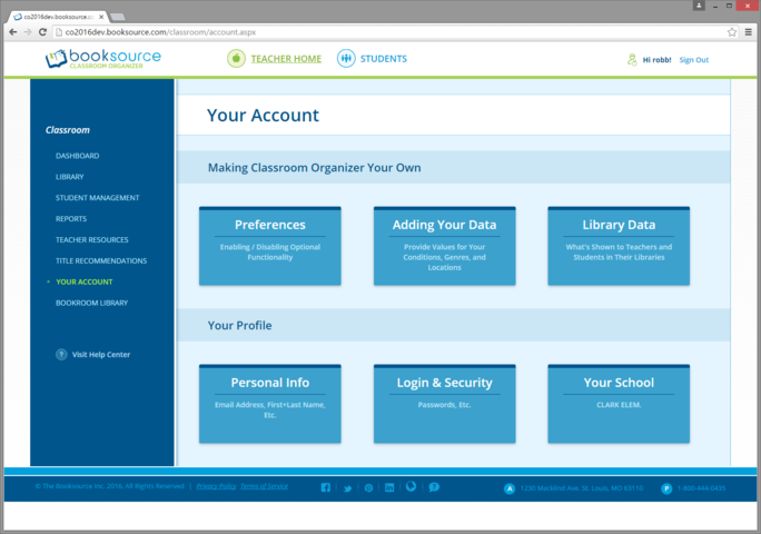
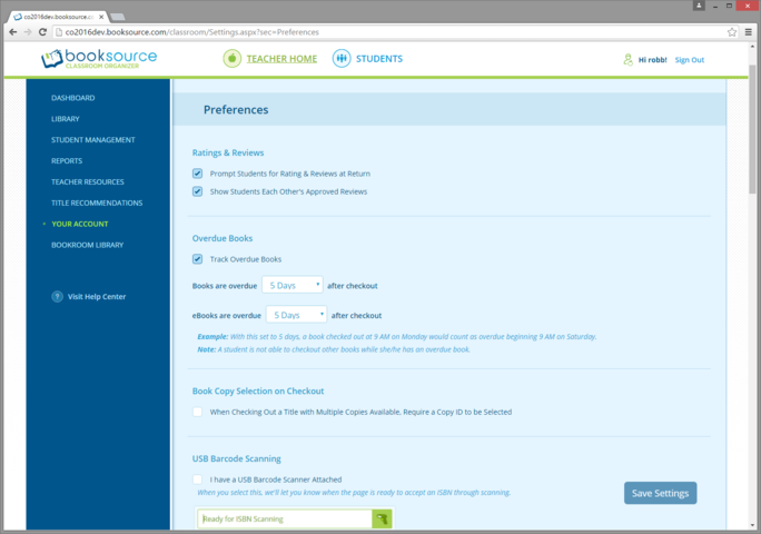
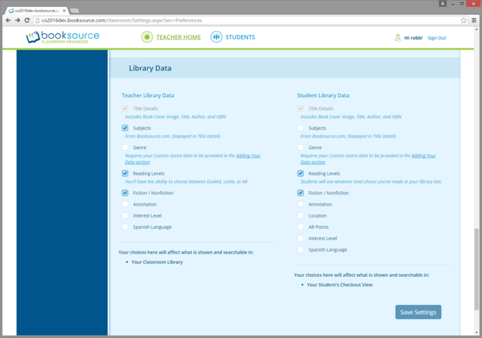
The app's considerable preferences were previously a hot mess. This page's purpose was to organize the various preferences so that users weren't overwhelmed. I'm particularly proud of the clarity I was able to bring through the content grouping and UI labelling on this page.
I put a lot of effort into describing these preferences in terms of what they do and the effect they will have. Further, the UI exposes the precise logic for things like when a book will become overdue and doesn't place the burden on the user to run an experiment to figure this out on their own.
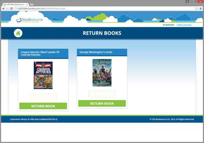
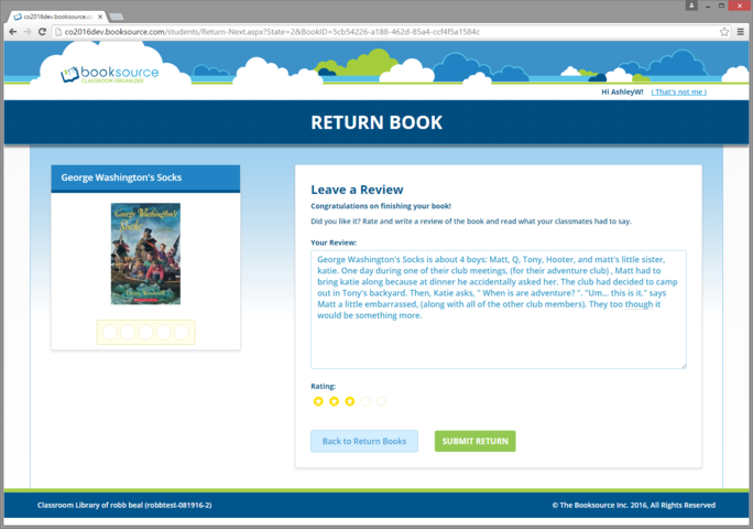
STUDENT-FACING EXPERIENCE
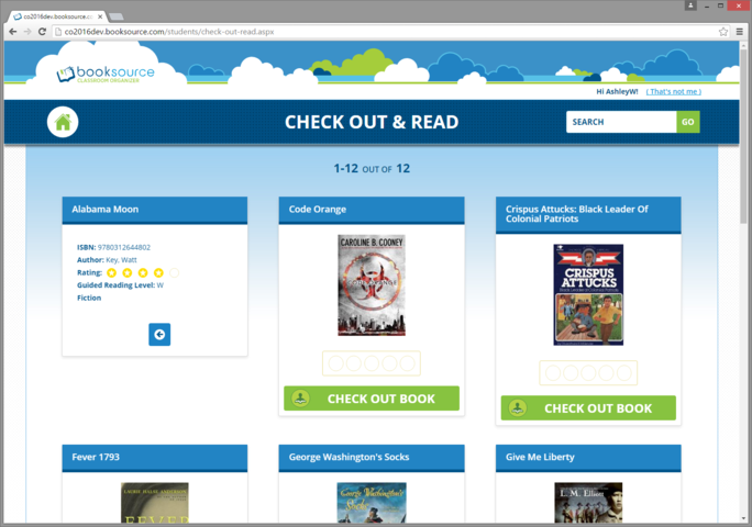
This is the home page of the student experience.
We chose to have a separate/distinct visual experience for students. A key challenge here was finding a visual experience that could span the enormous differences in kids spanning grades K-8. We initially did visual ideation with a ~2nd Grade student in mind, but management and teacher (see below) feedback pushed us closer to ~4th Grade visual sensibility.
Owing to their age and the difficulty of user research testing of kids, we used teachers as a proxy for kids in our user research for the student experience. Further, we found visual inspiration from other educational sites that addressed similar grade levels.
Finally, I had to make the tough call that we'd spend considerably more effort improving the teacher experience and consequently less effort on the student experience. The thinking was that if we didn't have teachers creating libraries, then it wouldn't matter that the student experience was stellar. Additionally, there was a considerable percentage of the user base that had chosen not to even utilize the student side of the app.
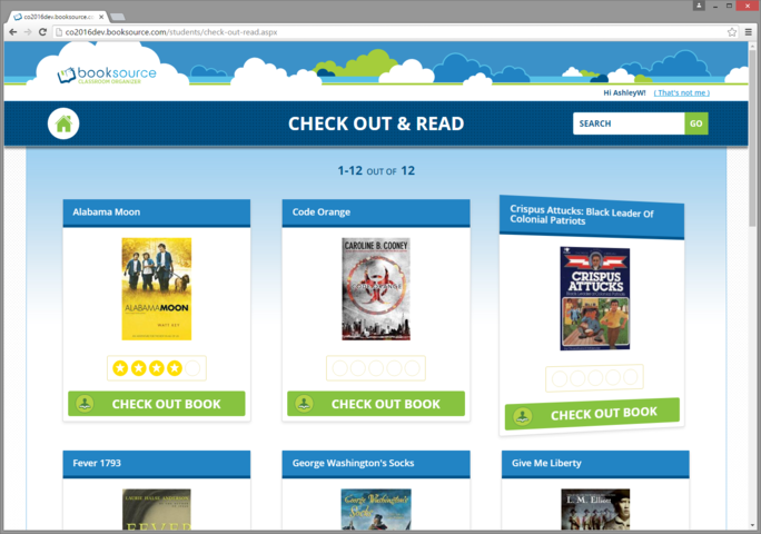
There are certain aspects of books that can be helpful for kids when deciding what to read. We chose to display this info to kids upon hovering over a book card. We used a card flip animation to add a sense of playfullness.
MISC. EXPERIENCES
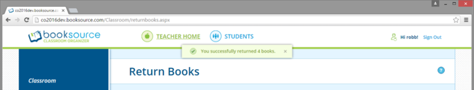
The previous version of the app didn't do a great job of communicating status to users and even when it did communicate status, it did so inconsistently.
We communicated the status of every important app action and did so through the snack bar UI pattern shown here. The effect of this work was much greater confidence in the app and much greater clarity about whether and why an action failed.
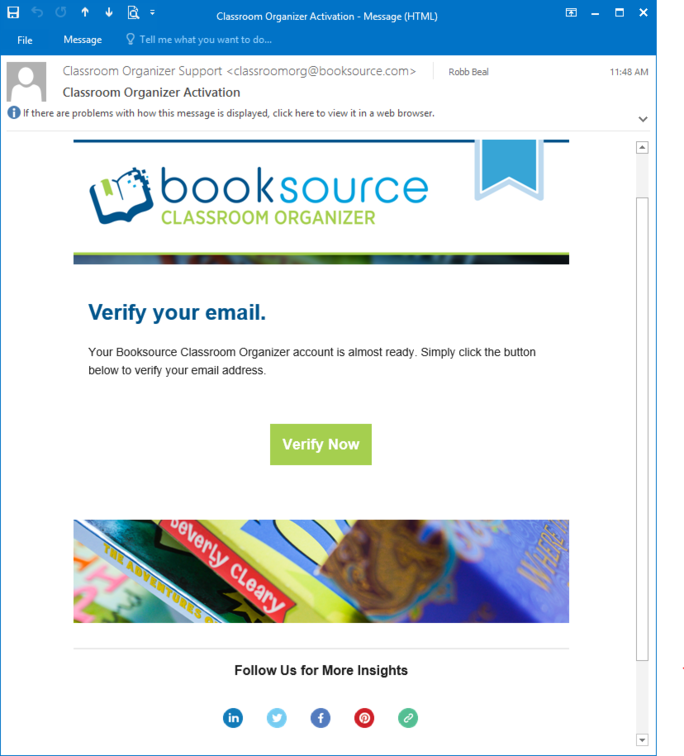
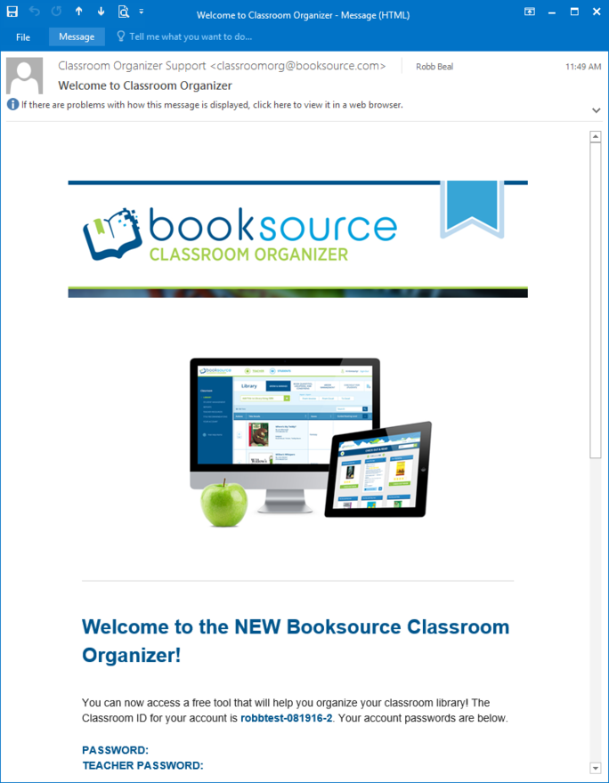
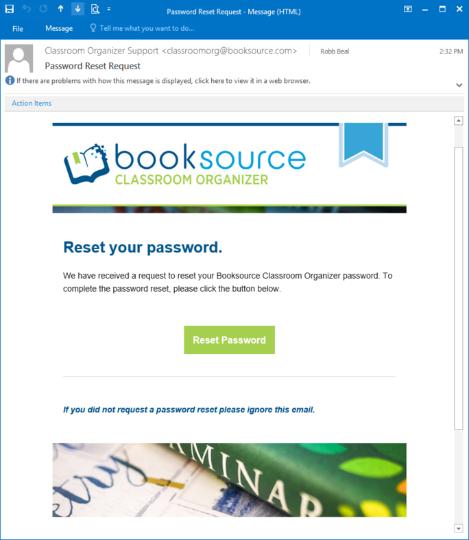
The previous version of the app had 2 or 3 separate email visual styles and the quality of the content of those emails and their calls to action was very poor.
Collaborating with a content designer, we made those emails visually consistent with clear copy and calls to action.
I was able to additionally eliminate a series of status emails whose content was now available from the app's Dashboard. Email deliverability was a consistent support issue which further motivated the elimination.
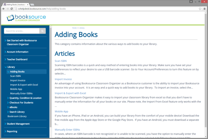
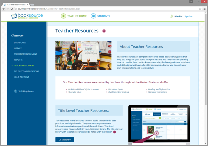
The previous app had a static, monolithic FAQ page that was not searchable, poorly maintained, and with articles that couldn't be linked to directly. In short, it wasn't a knowledge base.
I provided 4-5 candidate Help Center/KB apps and working with my junior product manager, identified our preferred solution. (The one we chose was one of the few Help Center/KB apps that had multi-level article grouping.) I then provided advice/guidance and even certain complex content to the junior product manager as she developed the Help Center/KB structure and content.
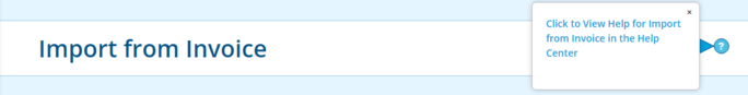
Finally, I decided where in the app to provide page-specific help (~15 pages) and to what topic/article to link to for each.
I'm a huge believer in the importance of a great 1st use experience for any app and thus chose to invest heavily in a 1st use walk through experience.
My team and I evaluated a number of walk through products (including building our own open source solution) and chose to use inlinemanual.com. It had the nice quality of additionally being able to provide the page-specific help functionality we needed.
I authored the product tour, striking just the right balance between number of steps and comprehensiveness and with the constraint that 1st time users would have empty libraries and student rosters.
This was a separate project at Booksource. It was the 1st launched project in collaboration with Liz Renda, the stellar product designer I hired after the launch of the Classroom Library app. Visit the live page.
My analysis of our analytics was telling us that this page was a key organic search landing page, but the team that did the previous site redesign managed to regress the page, choosing to turn it into a PDF that a) didn't link to any other site pages and thus was a dead end, b) didn't present well in Google search results, c) had no social sharing, and d) didn't have key branding elements. This page's design fixed all of those things.
Liz's visual and interaction design was sublime and she did a great job of working cross-functionally to understand and balance a variety of important content considerations. Because we wanted to ensure Liz's sublime visual design was implemented perfectly by our busy engineering team, she and I developed an HTML prototype that would serve as the starting point for the engineering team's implementation.
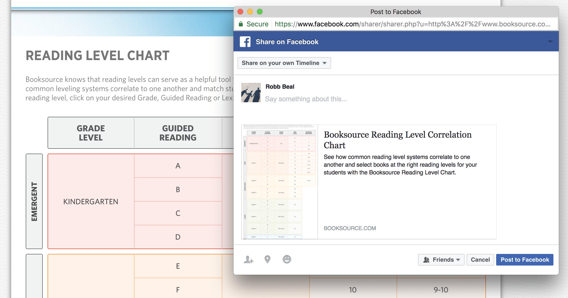
Finally, while Liz worked on the core of this page, working with her and a copywriter, I led the prototyping of this page's social sharing across Facebook, Twitter, and Pinterest. The prototyping allowed us to very deliberately consider things like a) how do we embed the shareable image of the page without displaying it to users, b) what is the optimal size and aspect ratio of the shareable image, and c) what fields (titles, descriptions, hashtags, etc) were available and what field length display limitations we would face across each social network.
Without taking this time to prototype, to really be comprehensive, this social sharing experience would have undoubtedly been lowest common denominator or worse, exposed to users for weeks or months until we had the opportunity to comprehensively redesign it.